
Confronted with ambiguous FDA guidelines last revised in 2009, our journey began by unraveling the complexities of the existing ISI landscape. These guidelines lacked specificity, leaving interpretation to Pfizer's Medical and Regulatory bodies. Consequently, the current ISI size (a minimum of 20% of the screen) failed to account for the diversity of modern screen sizes and their impact on user experience.
Create a consistent experience across all Pfizer brand websites. To achieve this, we needed to create a new ISI standard for our Helix Design System, update Pfizer's existing ISI guidelines, and propose the changes to the FDA. Through the implementation of a consistent format for conveying important safety information on our websites, our aim is to enhance patient comprehension, minimize the likelihood of medication errors, and improve overall website engagement. By reducing friction associated with the ISI component, we strive to create a seamless user experience that prioritizes user understanding and engagement.
To gain a comprehensive understanding of ISI best practices, we conducted an extensive competitive analysis, examining the approaches of various pharmaceutical companies. We observed a range of styles, sizes, and placements, including smaller ISIs and innovative modal and hero implementations. This analysis became the foundation for our reimagined ISI strategy.
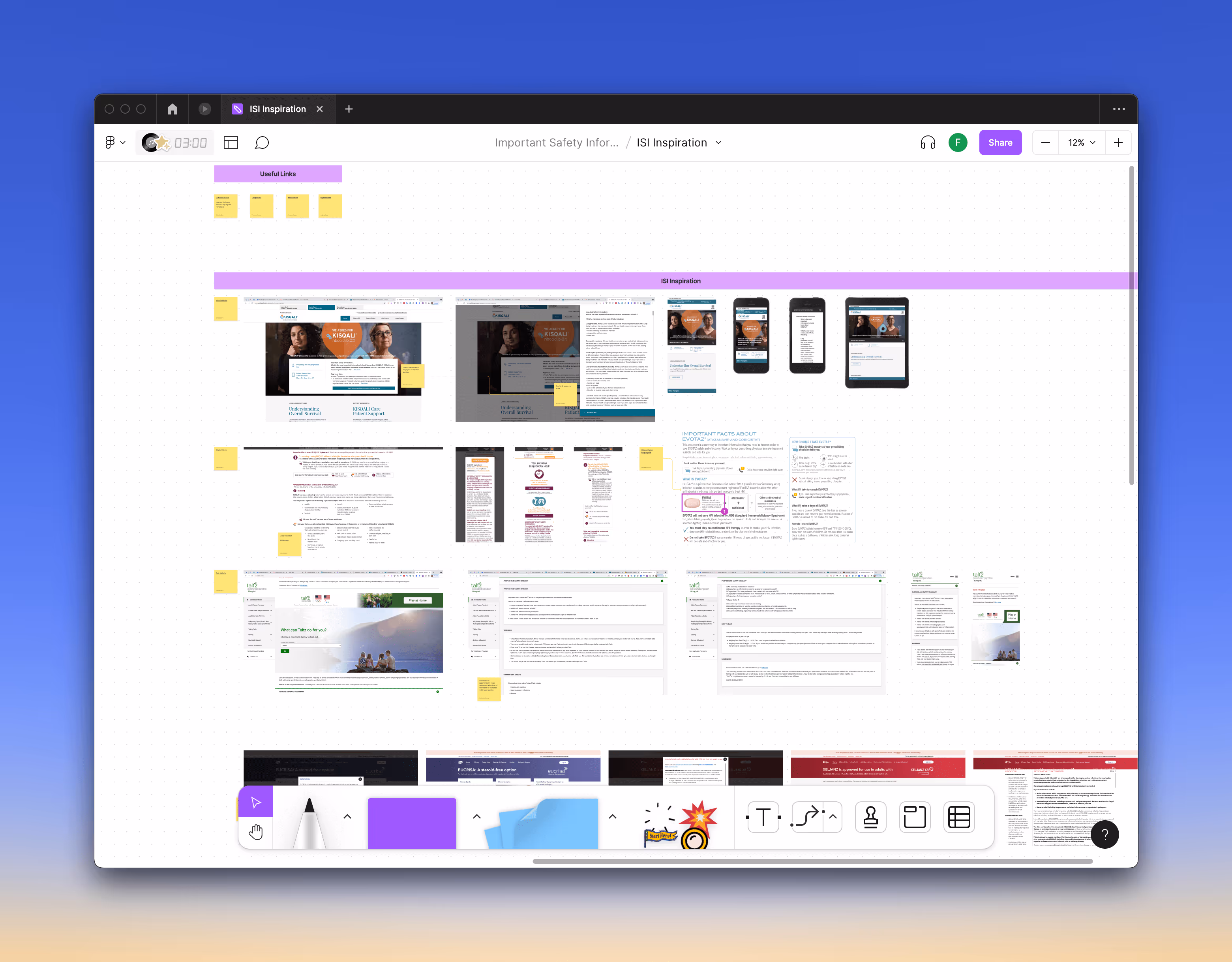
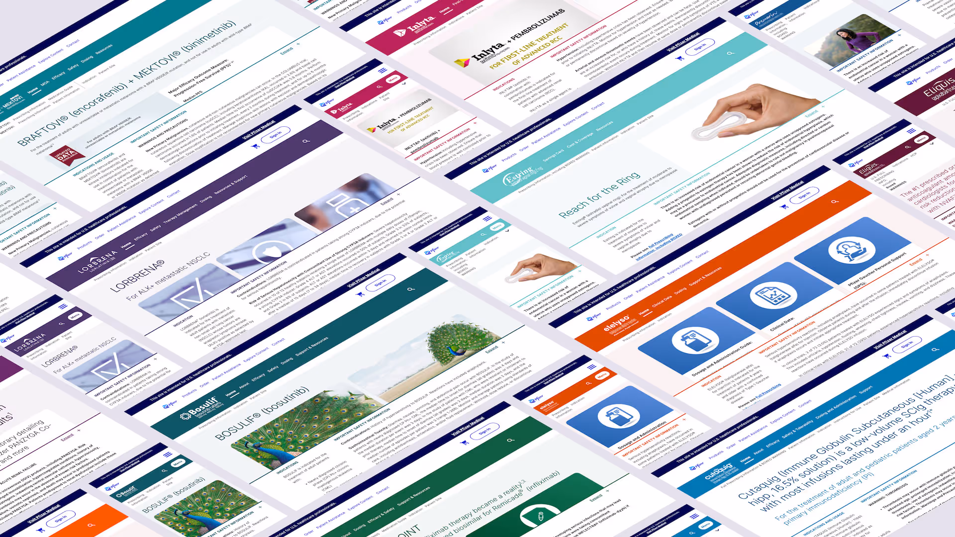
With over 150 prescription brands under Pfizer's umbrella, each brand followed its own ISI style, leading to a fragmented and resource-intensive maintenance process. We sought to consolidate these disparate components into a single standardized ISI format across all patient-facing websites, mirroring the successful approach used for PfizerPro websites. This streamlining aimed to enhance compliance, avoid legal repercussions, and provide a cohesive experience to patients.

To validate our hypotheses and inform our design decisions, we leveraged analytics data, user interaction heatmaps, and recorded usability testing sessions with patients. These sessions uncovered valuable insights, revealing frustration among users due to the size of the ISI, which obstructed their ability to consume website content. Armed with this knowledge, we set out to optimize the ISI component to create a more user-friendly experience.
With user feedback in mind, I developed four distinct prototype styles: Current Experience, Universal Patient Language, Modal, and Hero. These prototypes were further refined for both mobile and desktop screens, creating a total of eight interactive prototypes. By providing users with options for a smaller ISI and a collapsible feature, we aimed to reduce distractions and provide unobstructed access to website content.
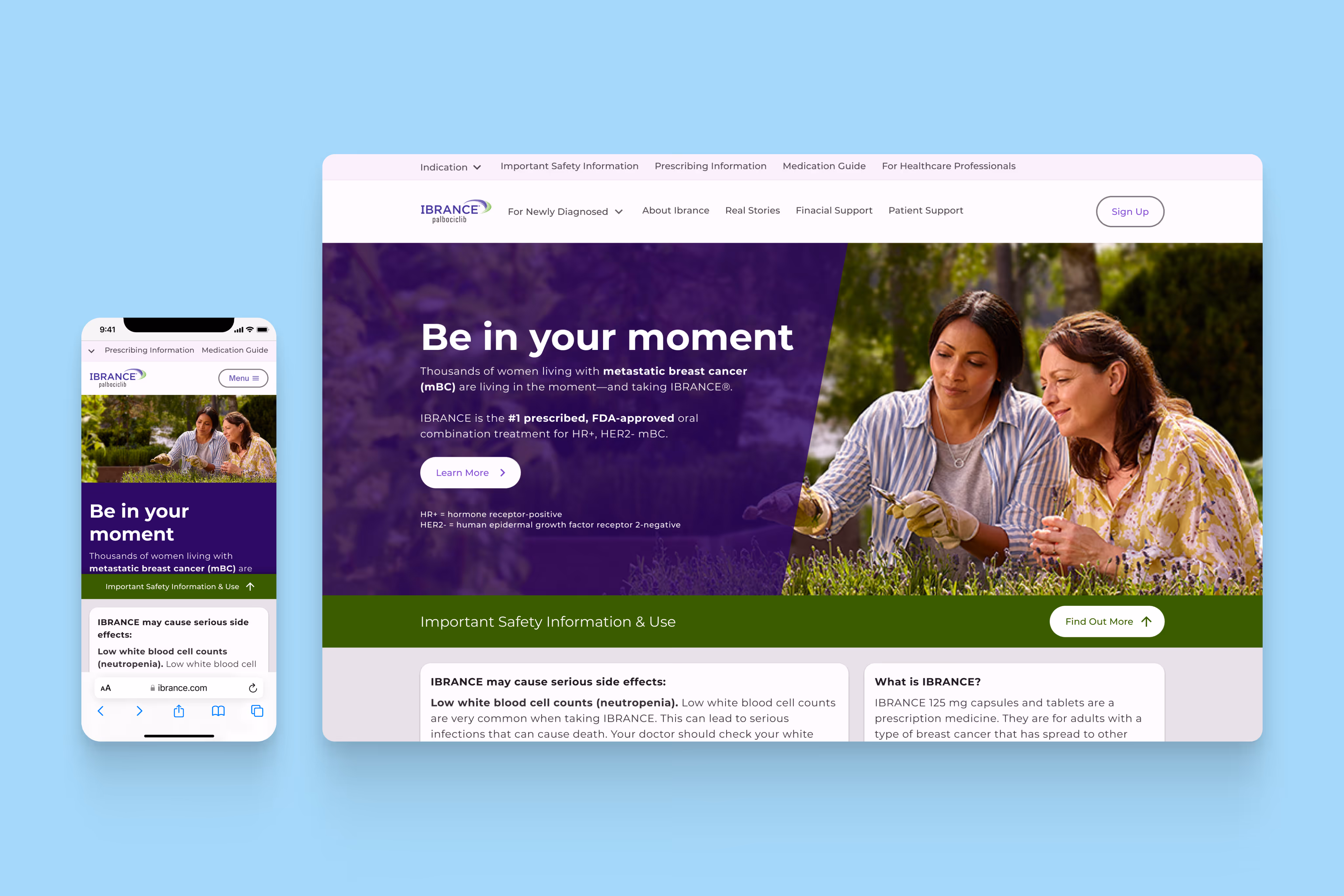
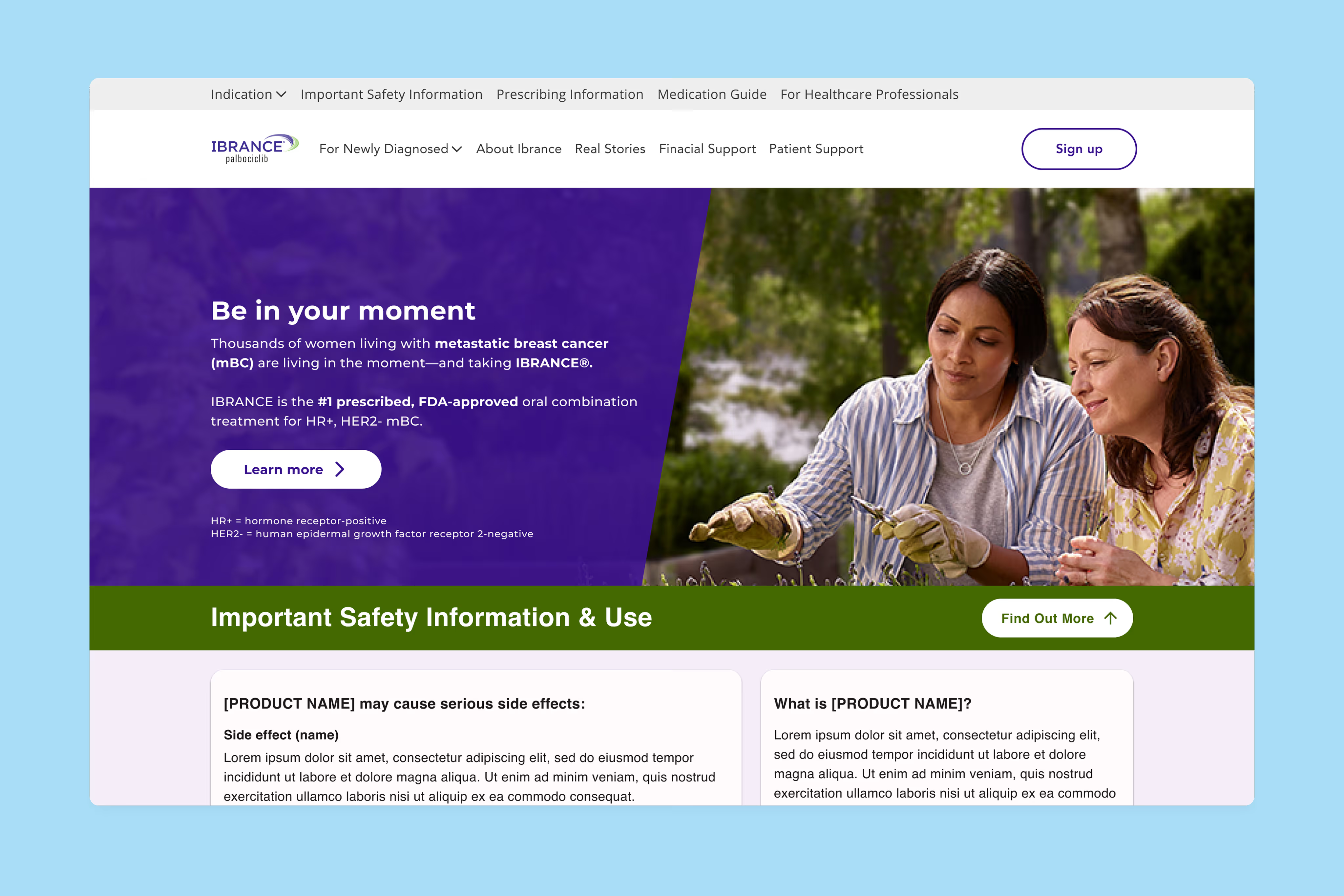
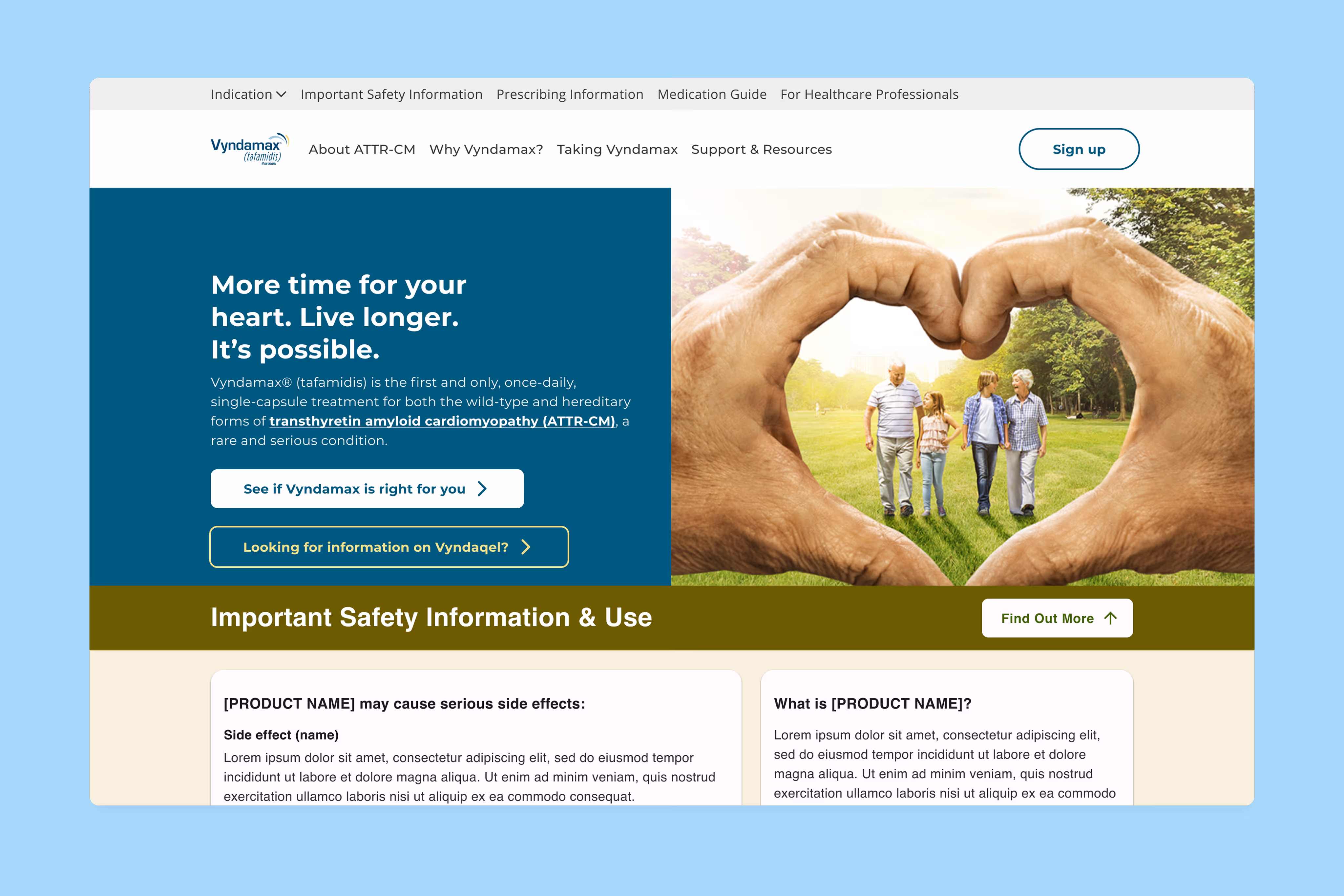
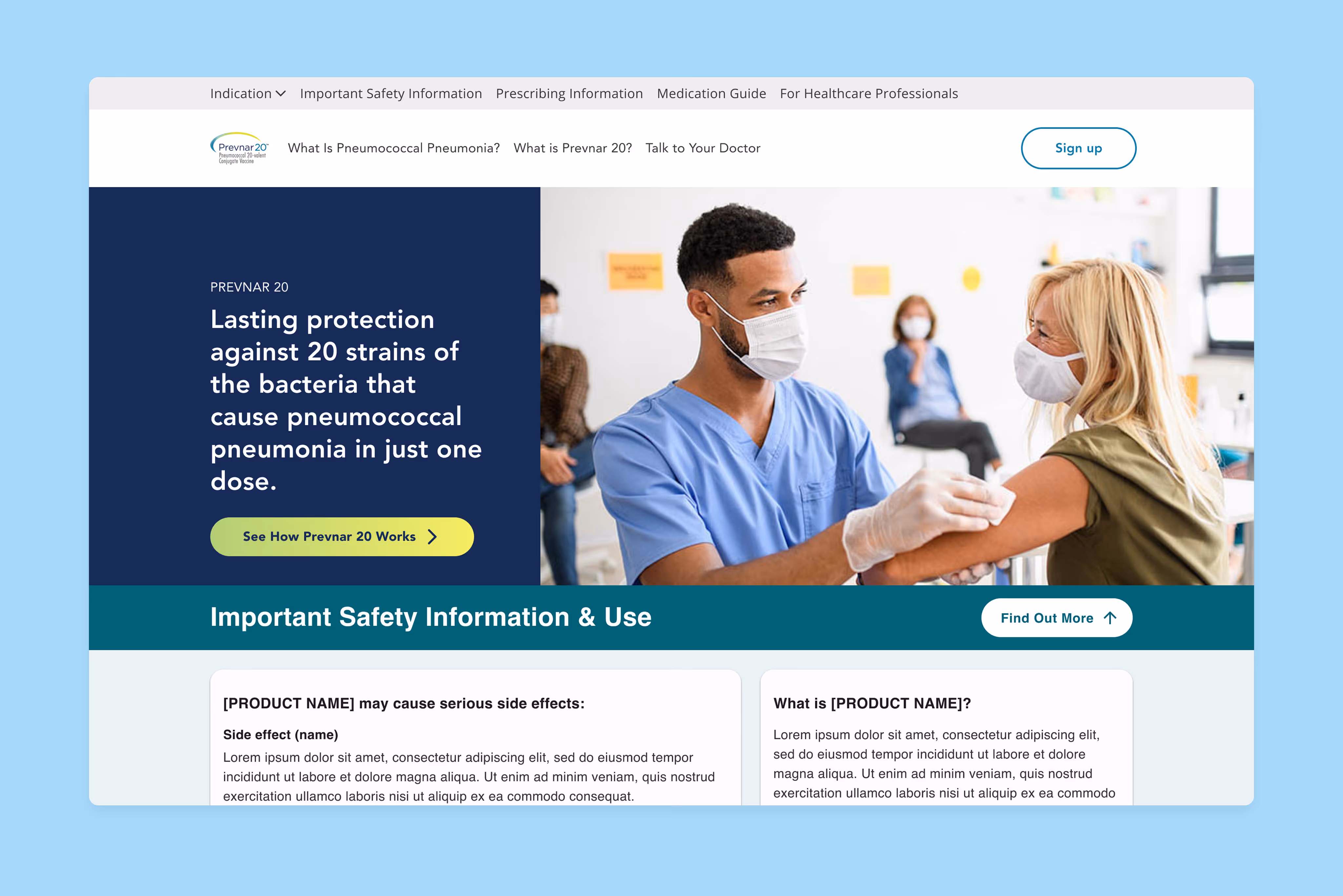
This prototype displays the ISI in its original format; 20% of the viewport height with Indication content on the left side and ISI content on the right side.
This prototype follows the guidance provided by the UPL website, which recommends using icons, white space, and simpler language to present safety information.
This prototype presents the ISI as a modal window, which is a pop-up that appears on top of the main page content. The modal includes a small paragraph of the ISI, as well as two buttons that allow users to choose how they want to interact with the information.
This prototype is prominently displayed at the top of the page, in the hero section, to ensure it is immediately visible to users. The design allows it to be unobtrusive, so as not to interfere with users' browsing experience. As the user scrolls down the page, the ISI transitions to a small, floating format that stays fixed at the bottom of the screen, but remains visible and easily accessible.
Through usability testing sessions with patients, we gained invaluable feedback that highlighted their expectations and preferences for the ISI experience. Patients tend to rely on healthcare professionals for ISI guidance, scanning for pertinent information and valuing easily accessible and uninterrupted experiences. Desktop computers emerged as the preferred medium for reviewing ISI due to their larger screens facilitating the consumption of dense text. Understanding these user-centric insights helped shape our solutions.
The profound implications of our research were reflected in the compelling results we obtained. By reducing the average ISI size from 27% to a more optimized scale, we not only improved user engagement but also maximized valuable screen real estate. The comprehensive ISI sizing guidelines and high-fidelity prototypes we developed enabled seamless collaboration with developers and Pfizer's Digital Review Team, ensuring a clear implementation process. Additionally, we updated Pfizer's Design System documentation to include thorough ISI guidelines, empowering future initiatives with a strong foundation.
A smaller, more accessible ISI made browsing smoother and more enjoyable, leading to increased interaction and user satisfaction.
Simpler language and clear visuals helped patients quickly understand important safety information and feel more confident.
By making ISI more visible and easier to digest, we reduced the chance of medication mistakes at critical decision points.
Standardizing ISI into one format saved time, reduced risk, and ensured we stayed aligned with regulatory requirements.
The collapsible ISI kept safety information available without overwhelming the page, balancing clarity with a clean user experience.